
Designing more relevance
Context
MSN’s new tab page was reimagined to create a calmer, more intentional start experience. The challenge was helping users transition from a dense, headline-heavy layout to something that felt relevant, focused, and worth engaging with.
My role
I led content design across the experience, defining hierarchy, section logic, and in-product guidance that helped users understand and adapt to the new model. I partnered closely with design, product, and research to test language and refine how personalization was introduced across both product and marketing surfaces.
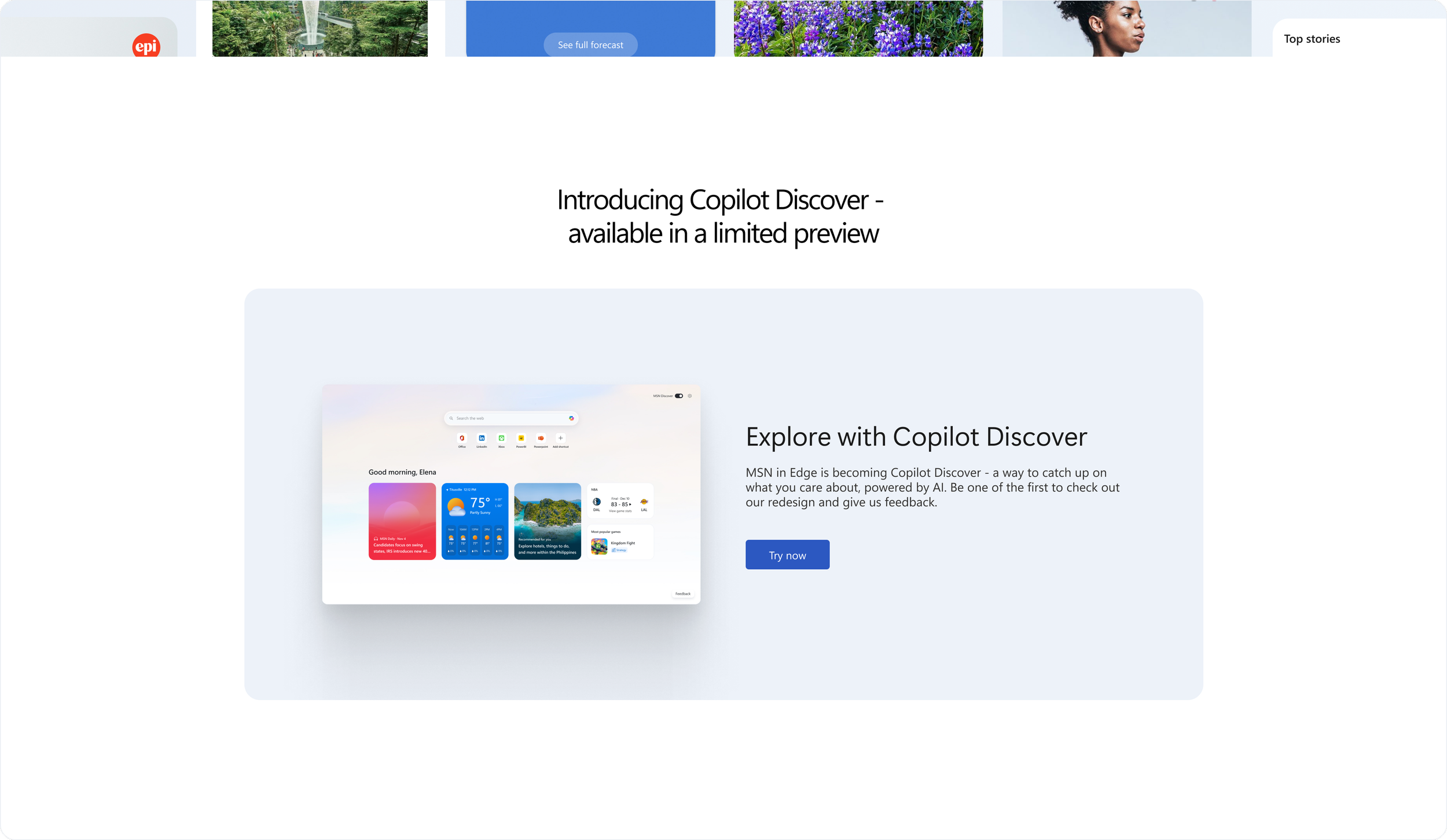
From new tab to Copilot Discover
The content on this page needed to introduce Copilot Discover clearly and confidently, helping users understand the shift from MSN to an AI-powered experience.
Although this page lived within marketing, I led the messaging in partnership with the PMM, design, and engineering. Because I had worked on the product experience, I ensured the positioning was accurate, differentiated, and aligned across Copilot surfaces.
The result was a clear, cohesive narrative that supported adoption and reinforced trust during a high-visibility transition.
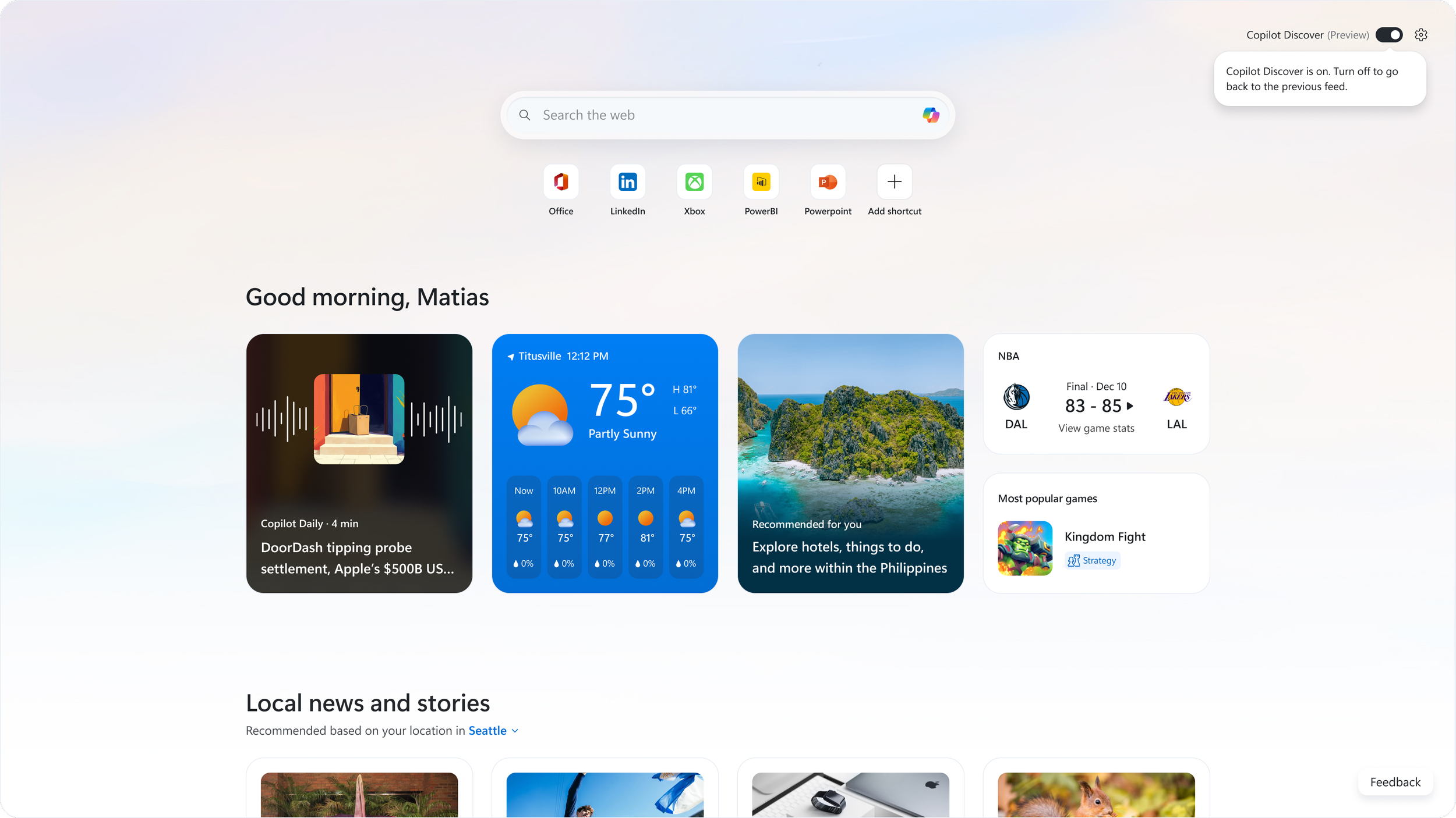
Calmer by design
The new experience moved away from a dense news grid toward a calmer, modular layout anchored by a personalized top section.
I defined section headers, hierarchy, and in-product messaging to clarify relevance and guide scanning. The language emphasized usefulness and control rather than automation.
Coachmarks and toggle messaging reinforced user choice, allowing people to return to the previous feed at any time and easing adoption during transition.
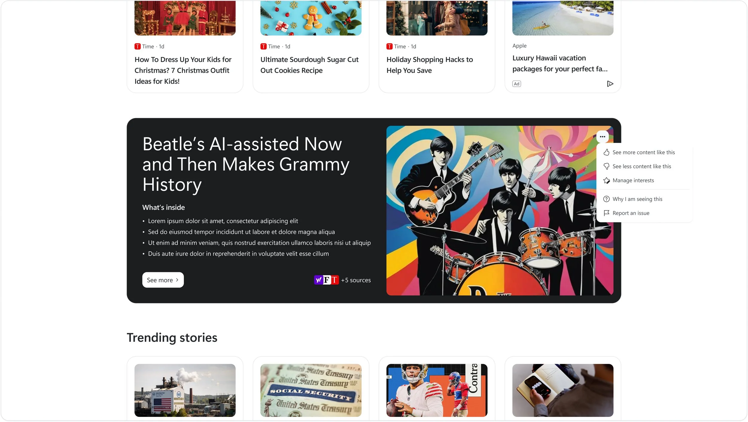
Curated entry points
This feature introduced a focused “deep dive” module that grouped related news into a single AI-curated collection, inviting users to click into a dedicated page with the full set of stories in one place.
I partnered with design and UXR to test different layouts and calls to action, refining elements like “See more” to clearly signal that this was a gateway to a broader view. I also ensured users remained in control, integrating feedback options so they could tune what they saw.
The goal was to make AI-powered aggregation feel thoughtful and transparent, creating a clear path from summary to source while keeping people in control of what they see.
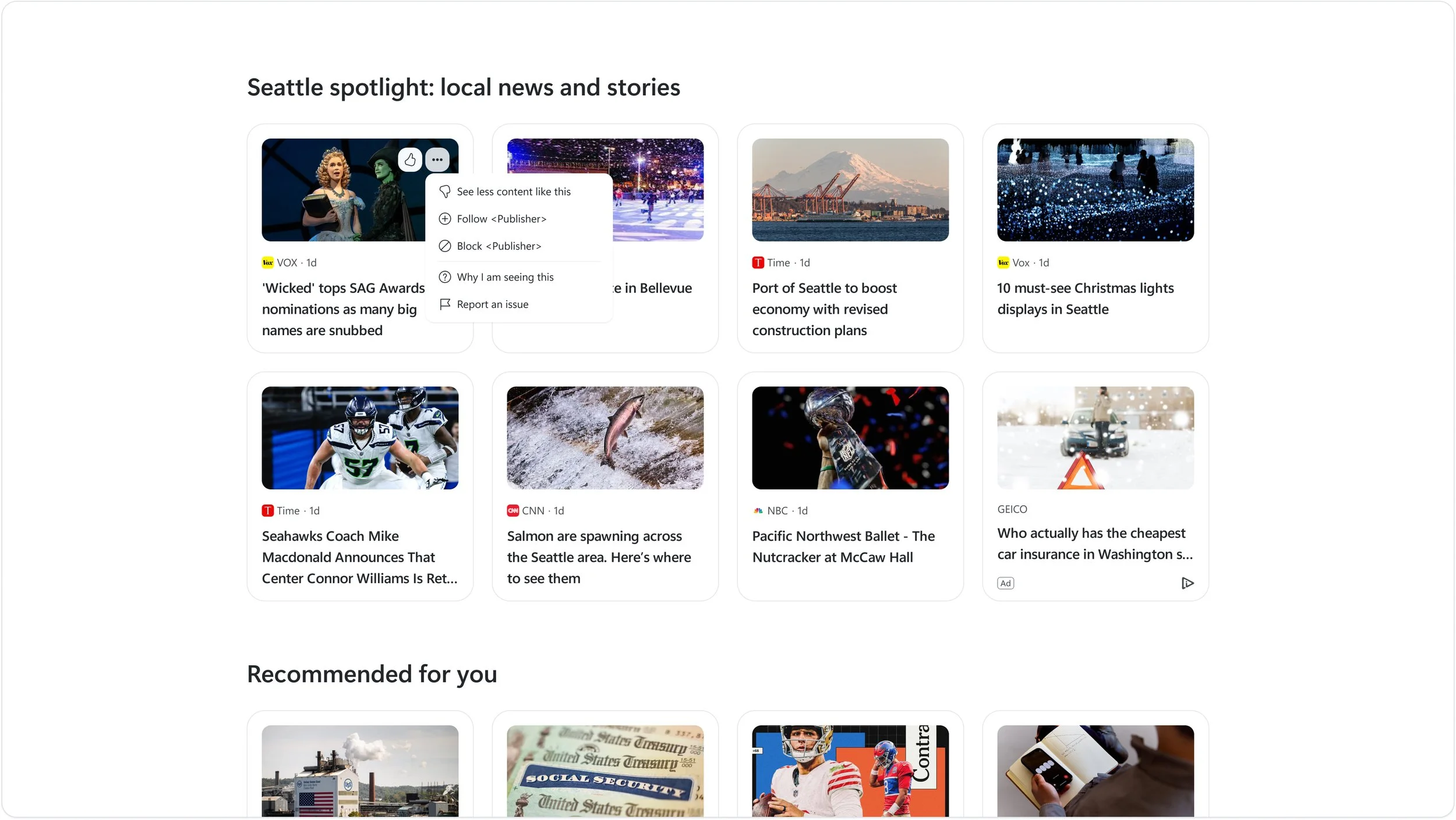
Feedback built into the feed
In-feed personalization controls allowed users to respond to individual stories without interrupting their browsing flow.
The goal was to make AI-driven recommendations feel transparent and adjustable. Feedback language was intentionally clear and lightweight, helping users understand why content appeared and how their signals would influence future recommendations.
Rather than overwhelming people with settings, the system used simple, contextual controls that reinforced trust and positioned personalization as an evolving dialogue between the user and the product.
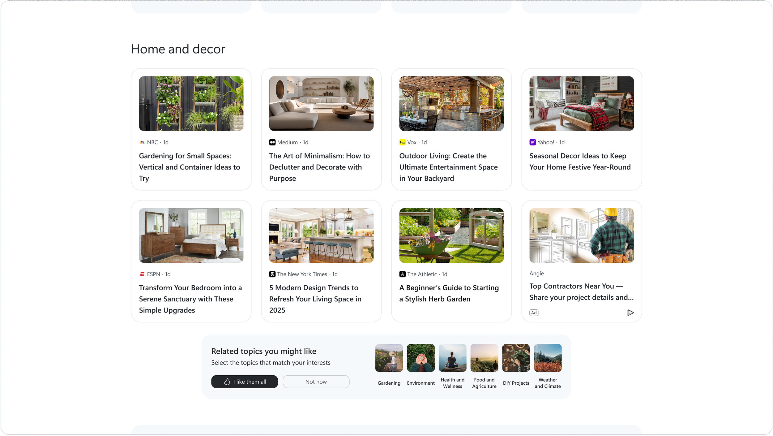
Turning signals into strategy
This feature paired implicit behavioral signals with in-context confirmations to strengthen personalization. Instead of relying only on inferred interest, we invited users to explicitly confirm topics they cared about.
That confirmation allowed the system to extend recommendations with greater confidence, shifting personalization from assumption to validated preference.
Impact
The work shifted the new tab experience from reactive scrolling to intentional discovery. It introduced a signal framework that balanced AI-driven recommendations with user control, creating a more trustworthy foundation for AI-powered personalization.